Friday, 2 May 2014

Final Ancillary

This is the improved advertisement and album cover. I enlarged the two faces and adjusted the text font on the advert to create a bigger impact and match the album cover more. I added a facebook and twitter icon and links to reach out to my target audience. I darkened the background and colour corrected the faces to match the album cover. 


I made the album cover more consistent by making all the backgrounds black with triangular orange tones. I made the colour consistent by using a colour effect called hue and saturation. I removed some of the songs so that there are 12 which is a conventional amount for an album. I also wrote down all of the copyright information and included a triangular guitar which replaced an actual photograph of a guitar. I chose to replace this because the triangular guitar matches the whole theme a lot more. 


Monday, 17 March 2014

Music Video Final Draft


This is the final draft of my music video with all the adjustments and improvements made. 

Music Video Draft 2


This is the second draft of my music video, some improvements need to be made. 

Music Video First Draft


This is the first draft of my music video. There are a lot of things that need to be improved such as the pace of editing could be much faster and cut to the beat more, the lip syncing could be better timed and there could be more shots in different locations. 

Sunday, 2 March 2014

Question 4

How did you use new media technologies in the construction, research, planning and evaluation stages?


All of these technologies converged together to make a more professional looking product compared to last years product. The DSLR cameras helped incorporate dynamic movement within my music video which we could stabilize in premiere pro if necessary and add transitions. I would document any progress I made in blogger and use YouTube as a source of research and a place to upload my footage.
 
This video gives a few tutorials on how I achieved the more technical elements in my music video such as the stop motion, green screen within a photo frame, transitions and Photoshop effects. It also states the different types of technologies I have used such as Premiere Pro, Camera, YouTube and Blogger and explains what I have used them for.

Question 1

In what ways does your media products use, develop or challenge forms and conventions from real media products?


In this video there are examples of conventions being used in real media products such as Demi Lovato's music videos. I talk about the conventions of music videos as a whole and then conventions of pop rock and how I have used them in my music video by giving examples. 

Below are examples of conventions of music videos and conventions of the pop rock genre. I have shown examples from real media products and compared that to my music video by showing my own examples of the same conventions I have used.

Lip Syncing 


Narrative


Montage editing


Diverse camera movement and variety of camera angles/shots


Low key lighting


Costume changes with the location


Editing cuts to the beat and increases when chorus plays


Thursday, 27 February 2014

Question 3

What have you learned from your audience feedback?


This video shows my target audience's response to my music video and ancillary texts. They answered question such as 'What do you think could be improved?' and 'What did you like the best?', so that i could get a feel for what needs to be the next step in terms of improving my music video and ancillary texts and what are the strengths within them. It also have me and my group a good feel for what the target audience expected from the pop rock genre and what was conventional.  

We improved the timing of the lip syncing because our feedback determined that the timing of the lip syncing was an area which needed to be improved. Here is an example of the lip syncing before: 


Here is what we did to improve the lip syncing: 


We added more of the drummer because our target audience wanted to see more of the drumming:


Our target audience also said that the editing was relatable to other music videos because the pace increased when it got closer to the chorus. I decided to make the pace faster and keep cutting to different locations and scenarios such as the stop motion, narrative and performance shots based on this feedback. 


Something our target audience said they wanted more of was narrative, therefore we spent more time to enhance our narrative by using green screen technology to incorporate the photo frame:


I worked on the advertisement and added more features like twitter and facebook symbols and links to appeal to my target audience more. I also adjusted the colour and size of some of the elements on the advertisement to create a bigger impact. Here is the end product for the advertisement: 


Question 2

How effective is the combination of your main product and ancillary texts?


This video explains how my ancillary texts and music video are linked and what they mean as a whole. 

The use of triangles and patterns connect all the products together. The advertisement has the triangular faces in the corners of the page just like the digipak does and they also both had a dispersed affect where the faces start to break away and disappear. This strongly links to the music video because there is the idea of the girls gradually breaking away from each other however still trying to grasp the memories which are fading away. The digipak also has the triangular pattern of the stop motion tattoo in the music video which symbolises a journey and different pathways spiraling off into different life choices. The spiral pattern can also represent confusion and not knowing which way to turn. 

The use of guitar images run throughout both the ancillary texts which are at diverse angles. I also included this in my music video through diverse camera movement and shots of me and Lindsay playing the guitar. The images have a filter over them so it flows with the consistency of the low key lighting and dark backgrounds. The filter is a warm red so it also matches the faces and patterns.

I have shown the relationship of the girls very well throughout and made it clear that they are an act of two by the use of the two hands touching each other and triangles dispersing off of them. I have also shown this in both ancillary texts bu using the faces and composing them of the page so they are looking at each other. In the music video there are many performance shots of the girls singing side by side and a relationship is shown in the narrative as well. 

Thursday, 6 February 2014

Second Draft Advertisement and Digipak


Album and Advertisement photos

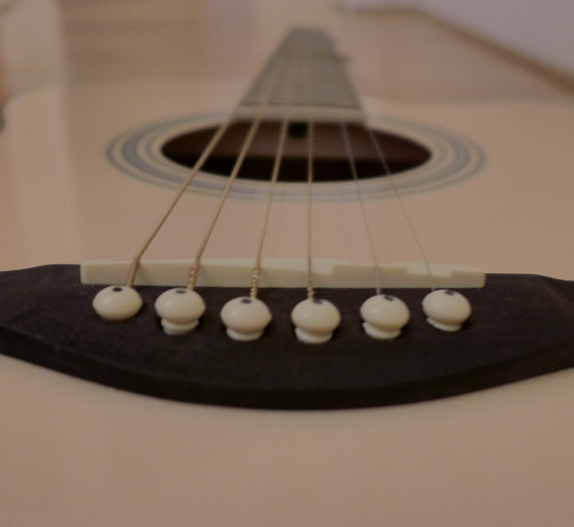
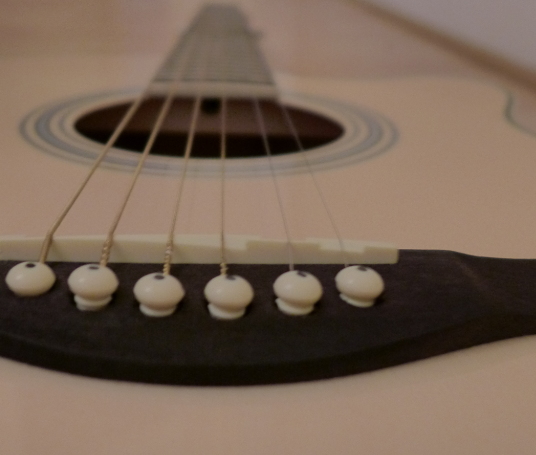
These are some experimental photographs I took of my guitar from different angles. They are going to be a part of the ancillary background as it will link nicely with my music video because one of the main props that was used in my music video was instruments, especially guitars. 


Friday, 17 January 2014

Advertisement


This is how we are creating the advertisement in Photoshop. We originally took a photo of me and Lindsay and are layering triangles on top to create an abstract effect. We are shading each triangle in a slightly different colour to give a sense of depth.

Friday, 10 January 2014

Rain Shots

To create the rain senario, we had to get a hose and press down on the end so it created a spray like result. We shot this in Lindsay's back garden so we could use the hose without any problems. The camera had to be far back so it didn't get wet, therefore we had to zoom in. We figured that we were only going to use this footage in the chorus of the song so we only sung through the chorus which helped due to the difficulty of these shots. 

We sung the chorus a number of times and each time we adjusted the camera so that we had a variety of shots.


Here are some clips from the rain shots we took. These are some of the ones that didn't work out so well, however they are good to see what was involved. It was challenging due to the cold weather conditions and also we had to prevent the equipment getting wet from the hose.

Photo Frame Editing

This clip involved a piece of green paper within the photo frame so we could later on edit and place a clip within the photo frame. This was the editing process:

1) Place clip in the timeline (work area)
2) Cut out unwanted parts
3) Go to 'Video Effects' - 'Ultra Key' then drag it onto selected clip
4) Click on the clip which has the ultra key on it 
5) Go to 'Effect Controls' - 'Ultra Key' - then click on the pipette symbol to then click on the green card within the frame. This makes all the green colour turn into other footage.